A Transformative Journey with The Community Solution
Reimagining a Brand
Saybrook University partnered with The Community Solution to enhance its brand image and improve marketing efforts.
Before joining The Community Solution Education System, Saybrook University was confronting obstacles to meaningful growth and expansion. The university sought to reinvigorate its brand identity and improve student recruitment outcomes by emphasizing its unique community and educational model. The rebrand and subsequent campaign highlighted Saybrook’s brand differentiators through imagery, content, and messaging that embodied the university’s personality and spoke to its strengths.
Establishing a Brand Identity
Every element of a brand’s visual identity must align its essence, conveying its values, purpose, and promises effectively. Saybrook required a new logo and visual identity that authentically embodied its community, core principles, and distinct approach to education. To determine how to best position the university to the marketplace and identify its strongest brand traits, The Community Solution’s Marketing Department conducted deep market research through surveys, focus groups, and conversations with students, alumni, and university leadership. Remaining true to the System’s commitment to collaborative work, marketing experts from The Community Solution worked closely with university leadership, faculty, alumni, and students to gain insight into the spirit and core identity of Saybrook University.
The Symbolic Logo
At the heart of the brand refresh was a new logo that authentically conveyed Saybrook’s brand essence and traits. Inspired by Saybrook’s founding principles based in humanistic psychology and exploration of human potential, the new logo features a hand-drawn, personalized icon. Crafted in a one-of-a-kind script, the logo conveys a sense of individuality and authenticity, reflecting the diverse and unique qualities of the Saybrook community.
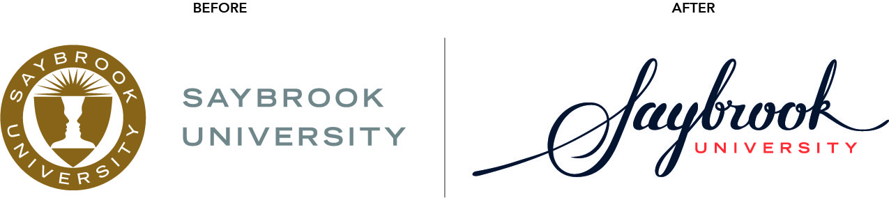
The S-shaped swoop in the logo symbolizes the pioneering spirit that lies at the core of the university’s philosophy. It signifies Saybrook’s commitment to breaking new ground in the field of humanistic education, fostering innovation, and creativity among its students and faculty.
The long tail of the K represents the legacy of Saybrook and the lasting impact its alumni will have for generations to come. This meaningful addition to the mark reinforces the idea that Saybrook is not just an academic institution, but a catalyst for positive change in society.
Meaningful Color Palette
Colors evoke emotions and can create strong connections with an audience, making them a vital part to any rebranding effort. The selection of Saybrook’s new brand colors was a thoughtful process intended to represent the natural world and the energy and peace human beings derive from it. The chosen colors resonated with the university’s humanistic philosophy, conveying a sense of warmth, inclusivity, and harmony.
 As an additional visual brand element, the flower of life, a symbol of interconnectedness and unity, was strategically incorporated into the brand materials. This sacred geometric pattern highlights a sense of connectivity across the Saybrook community, reinforcing the university’s commitment to fostering a tight-knit academic environment that values collaboration and cooperation.
A Story of Transformation
 The rebranding process marked a turning point for Saybrook University, unveiling a new era of growth and transformation. The revamped brand identity not only communicated the institution’s values but also empowered its leaders to unite individual programs and schools under one cohesive and unifying identity.
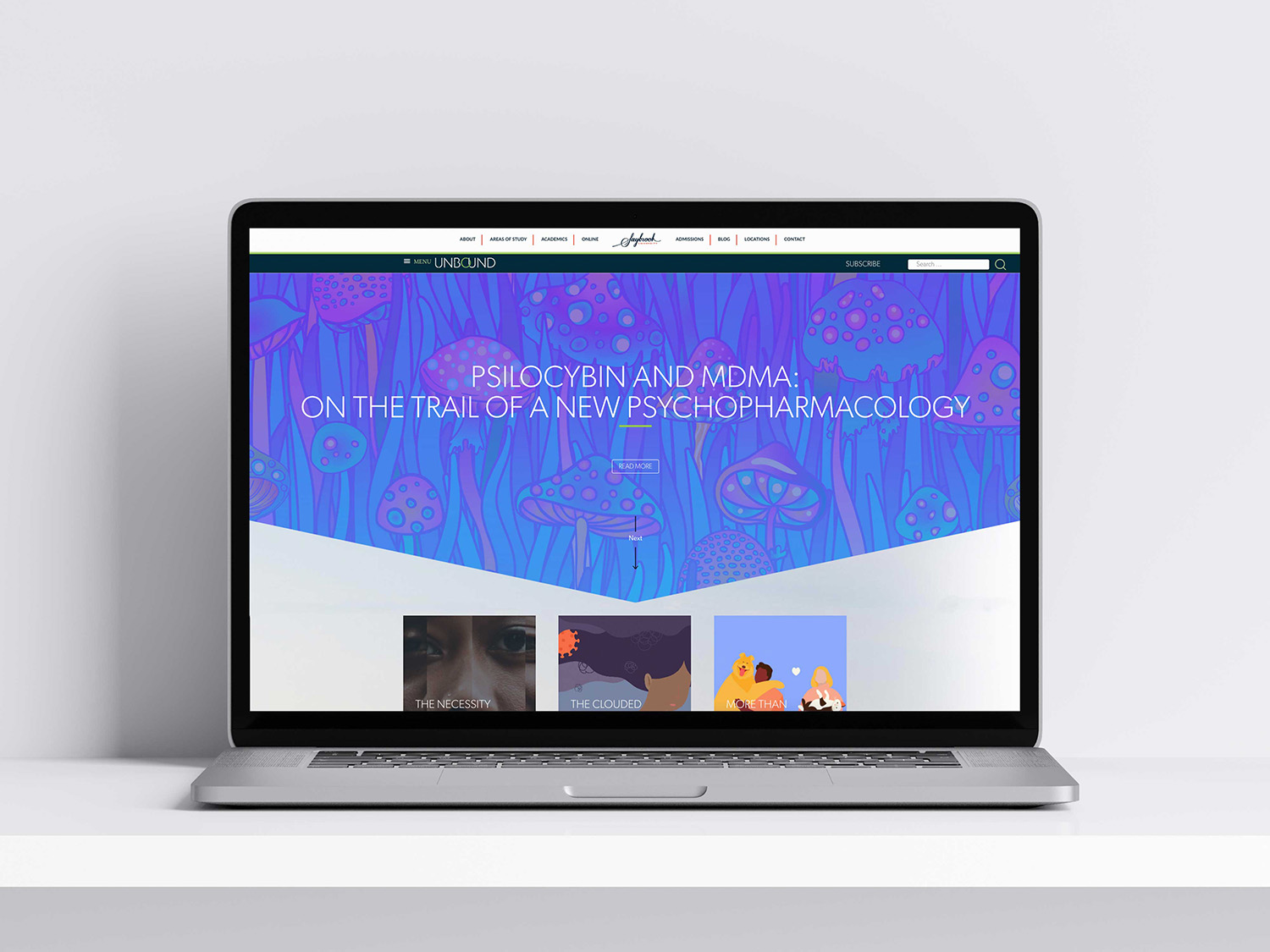
As a next step in elevating brand awareness for the university and elevating its profile in higher education, the Marketing Department partnered with university leaders in developing a strategy to elevate faculty thought leadership. UNBOUND is a digital magazine that goes far beyond a typical alumni magazine. Designed to communicate the innovative, creative, and pioneering spirit of Saybrook University, this digital magazine includes a dynamic mix of thought leadership, alumni profiles, creative student submissions, and content optimized for search (SEO). Total, UNBOUND contributes to 17% of organic traffic of Saybrook’s website, and has won numerous awards for its engaging storytelling and visually striking design.
Continued Success
In 2022, Saybrook met its long-standing goal of growing beyond 1,000 students, a success fueled by the revitalized brand and organizational efforts led by Saybrook President Nathan Long, Ph.D. to create a university environment that met student needs.
Saybrook’s rebrand and ongoing awareness campaign highlights the power of radical cooperation between System experts and university leaders. Cooperative work and openness to deep brand reflection led to a successful brand refresh that aligns the institution’s core values and aspirations with its external identity. By embracing its community and unique qualities, Saybrook continues down a path of growth and unity.
More Stories of Success