Before & After: Dallas Nursing Institute gets new look
Every logo tells a story. And seeing a logo for the first time, like meeting someone, leaves an impression.
Dallas Nursing Institute, which joined TCS Education System in 2013, wanted to tell its story in a new way and create a contemporary, positive impression within the local community. Our marketing team couldn’t wait to take on the challenge.
What’s involved? Myriad details, including a new logo, a new website, and a new message tailored to the March 11 surprise reveal to faculty and staff. First, our TCS Ed System marketing research team conducted studies to better understand the target audience and their motivations—a key element to ensuring that the new story was reflective of their needs and objectives. Then, our creative services team worked closely together to develop a new visual and verbal identity for DNI. The new approach more accurately reflects the school’s spirit of compassion, integrity and service, and capacity to transform its students by empowering them to embark on their journeys of independence and fulfillment.![]()
The old logo is reminiscent of an EKG reading. But DNI is more than diagnostic exams and charts. Its students are mature and energetic, representing a multitude of cultures. They want to advance their own careers, but they also have an innate desire to help others to live better and healthier lives.
The logo and rebranding aim to show what sets Dallas Nursing Institute apart from other nursing schools, including its highly qualified faculty, rigorous clinical training, and a holistic approach that puts the patient first.
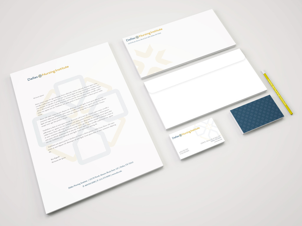
At the core of the new logo is a cross, an icon that evokes life and rejuvenation, a symbol that has been used to represent the medical profession for centuries. Four pentagonal shields surrounding the cross call to mind DNI’s rigorous educational program, and its students’ commitment to serve and care for others. The logo’s slate blue coloring reflects the strength and reliability of a DNI education and its graduates, while the logo’s amber gold color evokes the warmth, compassion, and optimism of the nursing school’s faculty, students, and alumni.
DNI President Dr. Pat Perryman likened the unveiling of the new logo to the arrival of spring.
“This new logo and look reignites the fact that DNI is still progressing and innovating,” she said. “Getting people ready for that next generation is what’s going to make a difference in health care.”
Check out DNI’s new look at dni.edu and let us know what you think.
Tweet us your impressions @TCSEdSystem or DNI @WeAreDNI.